Quantcast
Channel: Kruemels Bastel-Blog
Viewing all 2689 articles
Browse latest View live

Stempeleinmaleins - Ausgabe vom 24. Juni 2017

$
0
0

Hallo Ihr Lieben!
Heute startet die neue Challenge beim Stempeleinmaleins, wie immer mit einem Sketch.

Hello everyone!
Today we are starting our new challenge over at Stempeleinmaleins - again with a sketch for you to follow.

Ganz ehrlich, der Sketch hat mich Nerven gekostet! Da ging ja gar nichts mit meinen geliebten Lagen... Aber ein Sketch soll ja auch mal eine Herausforderung sein. Und außerdem war er perfekt für meine neuen Stempel von Lili of the Valley. 100 % zufrieden bin ich trotzdem nicht...
Ich habe drei Streife in unterschiedlichen Blautönen auf weißen Cardstock geklebt und daraus die Fenster ausgestanzt. Dahinter kamen dann die süßen Bären. Das alles habe ich dann noch rosa gemattet. 
Der Text ist aus dem Hochzeitsset von Creative-Depot. 
Ein paar Herzen auf Stielen sowie Gras und Blumen und zwei rosafarbene Ecken runden das ganze dann - mehr oder weniger - ab.

Honestly, this sketch was hard for me! No chance to include all those layers that I love so much... But well, a sketch should be a challenge every oce in a while. And at least it was perfect for my new stamps by Lili of the Valley. I still am not 100 % satisfied with how the card turned out...
I've put three strips of cardstock of different blues onto some white cardstock and then cut out the windows. Behind those I've put the colored in stamps and then matted everything using some light pink cardstock.
A few hearts on stems, grass and flowers and also two pink die cut corners finished this off - more or less.


Eine Piratenkarte für Stamping-Fairies

$
0
0

Hallo Ihr Lieben!
Heute zeige ich wieder ein Werk auf dem Stamping-Fairies Blog. Und wieder habe ich Stempel und Stanzen von MFT verarbeitet. Zuerst dachte ich ja, aus dem Juni-Release brauche ich jetzt nicht unbedingt etwas. Aber dann kam mir die Idee zu dieser Karte...

Hello everyone!
Today I am sharing another card over at the Stamping-Fairies Blog. And again I've used stamps and dies by MFT. First I thought I didn't need any of the june release but then I had the idea for this card...

Für die Holzoptik im Hintergrund habe ich das Holzmuster mit klarem Embossingpulver auf Aquarell-Cardstock embosst und darüber dann Distress Ink Frayed Burlap aufgetragen. So entsteht ein wenig der Eindruck, die kleine Piratin steht im Inneren eines Schiffs und schaut aus dem Bullauge.
Ich habe hier auch noch ein paar kleine Tupfer schwarzes Enamel Accents aufgebracht, einfach damit sich noch ein wenig etwas tut auf der großen freien Fläche.

For the wooden optic in the background I've stamped the wood print onto watercolor paper and then heat embossed it with clear embossing powder. Then I've added Distress Ink Frayed Burlap on top. Now it looks like the little pirate is standing inside a ship, looking out the window.
I also added a few small dots with black Enamel Accents here, just to have a little something on that big plain area.


Für das Fenster habe ich das Ocean View Porthole aus goldenem Spiegelkarton ausgestanzt. In die Ausstanzung kam eines der Circle Shaker Pouches, das ich mit ein paar klaren Mini-Kugeln gefüllt habe. Wenn man die Karte langsam schüttelt, schaut es aus wie kleine Blubberblasen.
Hinter den Shakerteil - ich habe ihn von hinten mit klarer Folie verschlossen - habe ich dann diese Szene gesetzt. Dafür habe ich die Schatztruhe und die Goldmünzen aus dem Party like a Pirate Stempelset abgestempelt und mit Copics coloriert. Dann habe ich mit Distress Ink Broken China erst nur den Bereich drumherum gewischt - Schatztruhe und Goldmünzen habe ich mit Maskiertape abgedeckt - und anschließend auch ganz wenig Farbe über der Schatztruhe und dem Gold verteilt, so dass es aussieht, als wären sie im Wasser. Dann habe ich ein paar Wasserpflanzen und Fische aus dem Mermazing Stempelset drumherum/drüber gestempelt. Dafür habe ich Distress Oxide Fired Brick und Iced Spruce benutzt.

For the window I've die cut the Ocean View Porthole from golden mirror cardstock. Into the cut out area I've put one of the Circle Shaker Pouches that is filled with some tiny clear beads. If you shake the card slightly it looks like little bubbles coming up.
Behind this shaker part - the back of the pouch is sealed with transparency - I've put this under water scene. I've stamped and colored in the treasure chest and the coins from the Party like a Pirate stamp set before adding Distress Ink Broken China only around the images (I covered them with masking tape for this step). Then I applied just a little bit of ink on top of the chest and coins to make them look like they are under water. Then I've added some underwater plants and fish from the Mermazing stamp set using Distress Oxide Fired Brick and Iced Spruce.


Die kleine Piratin ist mit Copics coloriert. Ich finde, sie sieht so erschrocken aus als hätte sie gerade einen Schatz gefunden... ;)

The little pirate is colored in with Copics. I think she looks a little surprised - like if she'd just discovered a treasure... ;)


Oben an der Karte habe ich dann noch ein kleines Banner aus gestreiftem Papier angebracht - und natürlich darf zumindest ein Totenkopf hier nicht fehlen!

To the top of the card I've added a small banner cut from red and white striped designer's paper - and of course I had to add at least one skull here.

Und vielleicht habe Ihr diese Kreislinie im Bullauge gesehen. Nun, wenn man denkt, besser als ein Schatz kann es nicht mehr werden... schwimmt eine kleine Schildkröte am Fenster vorbei! Ich habe das für Euch mal gefilmt:

And maybe you've discovered that circle line inside the porthole. Well, as soon as you think it can't get any better than discovering a treasure.... there's a little turtoise swimmin by your window. I took a little movie of it for you:


Die Schildkröte ist an den Rand eines Kreises aus Folie geklebt. Den habe ich mit einem Brad an der Karte befestigt. Er musste so groß ausfallen, damit die Schildkröte auch einen schön großen Bogen schwimmt.
Am unteren Ende des Kreises habe ich noch zwei Stempel aus dem Stempelset Interactive Labels aufgestempelt. Das Set finde ich klasse, genau das, was man für alle möglichen interaktiven Karten braucht!

The tortoise is glued to the edge of a circle cut from transparency. I've attached this to my card with a brad that had to be that big so the turtle swerves by nicely.
To the lower end of the circle I've stamped two stamps from the Interactive Label stamp set. I think this is a must have for any of those interactive cards.


https://www.stamping-fairies.de/stempelzubehoer/embossingpulver/ranger/ranger-embossing-pulver-clear.htmlhttps://www.stamping-fairies.de/stempelzubehoer/stempelkissen/distress-ink/distress-ink-frayed-burlap.htmlhttps://www.stamping-fairies.de/enamel-accents-black-tie.htmlhttps://www.stamping-fairies.de/stempelzubehoer/stempelkissen/distress-ink/distress-ink-broken-china.htmlhttps://www.stamping-fairies.de/neuheiten/maerz-2017/ranger-tim-holtz-distress-oxide-pad-fired-brick.htmlhttps://www.stamping-fairies.de/neuheiten/maerz-2017/ranger-tim-holtz-distress-oxide-pad-iced-spruce.htmlhttps://www.stamping-fairies.de/montierte-stempel/mft/mft-mermazing.htmlhttps://www.stamping-fairies.de/werkzeuge-nuetzliches/die-namics/die-namics-ocean-view-porthole.htmlhttps://www.stamping-fairies.de/montierte-stempel/mft/mft-interactive-labels.htmlhttps://www.stamping-fairies.de/montierte-stempel/mft/mft-party-like-a-pirate.htmlhttps://www.stamping-fairies.de/werkzeuge-nuetzliches/werkzeuge/mft-replenishments-circle-shaker-pouches.html

Eine Gummibärchenverpackung für Kulricke

$
0
0

Hallo Ihr Lieben!
Heute zeige ich auf dem Kulricke Blog eine weitere Gummibärchen-Verpackung. Natürlich wieder mit dem passenden Gummibärchen-Stempelset gemacht.

Hello everyone!
Over at the Kulricke Blog I am sharing another gumbear gift today. Of course again made using the Gummibärchen stamps.

Die Verpackung an sich besteht aus einem Streifen grünen Cardstock, den ich passend gefalzt habe. Darauf habe ich dann überall das Wort Gummibärchen aufgestempelt (das ist die erste Zeile eines der Stempel, die zweite folgt dann neben den Gummibärchen). Außerdem habe ich die Ränder etwas gewischt und ein paar rote Enamel Accent aufgebracht.

The gift is made from a strip of green cardstock that was scored matching the size of the gumbears inside. Then I've stamped the word "gumbear" all over the strip and also inked up the edges a bit. Then I've added a few red Enamel Accents.


Die Gummibärchen sind mit Copics coloriert und - damit sie schön glänzen - mit Glossy Accents überzogen. Die orangefarbenen mag ich eigentlich nicht so sehr (sie sind aber immer noch besser als die gelben!), aber hier passte es so schön ins Farbkonzept... ;)
Die Kreise hatte ich noch vom Regenbogen meiner Einhornkarte übrig und habe hier etwas Restverwertung betrieben. Sie sind mit den Nesting Stitched Circles gemacht. Darunter habe ich noch ein weißes Doily gepackt.

The gumbears are colored in with Copics and to add a nice shine to them I've covered them with Glossy Accents. I don't really like the orange ones that much (allthough they still taste better than the yellow ones!) but it fit good in my color scheme... ;)
I had those circles left over from when I made the rainbow for my unicorn card a little ago and so I used up some of them here. They were made using the Nesting Stitched Circles dies and I've added a white doily underneath.


Auch auf der Rückseite habe ich das Wort Gummibärchen aufgestempelt, darauf achtend, dass es bei geschlossener Box auch richtig herum lesbar ist.
Außerdem habe ich noch einen weiteren Text aus dem Gummibärchen-Set hier aufgeklebt und zum Matten bw. für das Band die Farben von den Kreisen auf der Vorderseite aufgegriffen.
Außerdem habe ich einen Verschluss für die Box/den Umschlag gefertigt. Dazu habe ich eine Stanze von Memorybox benutzt.

Also on the backside I've added the word gumbear making sure it can be read when the box is closed. I also added another text here meaning "a day without gumbears is possible but senseless". For the matting and the ribbon again I used the colors from the front.
I also added a closure for my envelope here that was made using a die by Memorybox. 


Und so sieht die Verpackung geöffnet aus. Innen habe ich sie einfach blank gelassen...

And this is the opened gift. I just kept the inside plain.


https://www.kulricke.de/product_info.php?info=p449_nesting-stitched-circle-stanzen.htmlhttps://www.kulricke.de/product_info.php?info=p613_gummibaerchen-set.html

Stempeleinmaleins - Ausgabe vom 1. Juli 2017

$
0
0

Hallo Ihr Lieben!
Beim Stempeleinmaleins zeigen wir Euch heute eine Tricky Box. Nein, die ist nicht tricky zu machen, sondern im Gegenteil, ganz einfach! Aber geöffnet macht sie mehr her, als auf den ersten Blick zu vermuten wäre.

Hello everyone!
Over at Stempeleinmaleins we are sharing a Tricky Box today. And no, it didn't get its name because it's so tricky to make it! But opened up it is more than you might have guessed from its outside look.

Ich habe meine Box aus craftfarbenem Cardstock gemacht, darauf kam eine Lage lilafarbener Cardstock und darüber ganz leicht gemustertes Designpapier. Da mir das zu fad war, habe ich Kleeblätter daraufgestempelt. Die sind aus einem Stempelset von Creative-Depot. Und Kleeblätter passen doch immer, oder?
Auf den Deckel habe ich ein ausgestanztes "Schokolade" geklebt, darunter befindet sich etwas Twine. Und das erste O habe ich durch den süßen Elefanten ersetzt.

I made my box from craft colored cardstock, then added a layer of purple cardstock and a designer's paper with a very soft pattern on top of that. It looked too plain to me so I stamped little clovers all over the papers. Clovers always work, right?
To the lid I've glued a die cut "chocolat" word with some twine tucked underneath. And I replaced the first O with this cute little elephant.


Und so sieht die geöffnete Box aus - naja, halb geöffnet. Manchmal bräuchte man zum Fotografieren 4 Hände! Aber ich denke, man kann erkennen, dass es eben nicht nur einfach eine rechteckige Box ist. Und es passt einiges hinein!

And this is the opened box - oh well, at least it's half way opened. Sometimes I'd need 4 hands to take pictures! But I think you can guess that it's not just a rectangle box. And there's quite some room in it!


Eine neue Challenge bei Stamping-Fairies

$
0
0

Hallo Ihr Lieben!
Heute startet die neue Challenge auf dem Stamping-Fairies Blog mit dem Thema "Sommer, Sonne, Strand und Meer". Ich habe eine fröhlich-erfrischende Soda-Karte gemacht. Sie ist von den Farben her mal richtig fröhlich - und eine kühle Erfrischung ist bei diesen Temperature doch auch immer willkommen, oder?

Hello everyone!
Over at the Stamping-Fairies Blog we are starting our new challenge with the theme of "summer, sun, beach and sea" today. I made a happy and refreshing Soda card. I went with really bright colors here - and a cool drink is always great with those temperatures we're having right now.

Für meine Karte habe ich das Streifenmuster mit Versafine auf Aquarellpapier gestempelt und mit klarem Embossingpulver embosst. Darüber habe ich dann Distress Ink Festive Berries gewischt, dunkler am unteren Ende und nach oben hin immer heller. Da das Embossingpulver auf dem rauheren Aquarellpapier nicht 100 % deckt, sieht man auch hier noch ein paar rote Tupfer, aber gerade das finde ich interessant.
Dann habe ich einen der Stitched Arch Stax aus dem Hintergrund ausgeschnitten, um ein Fenster zu schaffen.

For my card I stamped the stripes on watercolor paper using Versafine and then used clear embossing powder over it. Then I covered the background with Distress Ink Festive Berries, having a deeper color on the bottom and going lighter on the way up. Since the embossing powder isn't covering the whole stripes on the rougher watercolor paper some of the red is showing in those stipres as well but I think that makes it more interesting.
Then I used one of the Stitched Arch Stax to cut out a window from the background.

Unten auf die Karte kam dann noch ein schwarz gematteter Text. Für den zweifarbigen Abdruck habe ich die Distress Ink Stifte verwendet um den Stempel einzufärben.

To the bottom of the card I've attached a saying, matted black. To get the two colored image I used the Distress Ink Markers to bring color to my stamp.


Und hier kommt die Erfrischung.
Der Hintergrund ist mit Distress Ink Twisted Citron gewischt. Vorher habe ich Goosebumps Spray auf das Aquarellpapier aufgetragen. Dort kann man die Farbe wieder abwischen und erhält so die weißen Flecken. Dann habe ich noch den Twisted Citron Marker in den Distress Marker Spritzer "eingespannt" und noch ein paar kleine Flecken aufgesprüht, die dann dunkler wirken. Das ganze kam mit etwas Abstand in den ausgestanzten Ausschnitt und alles wurde schwarz gemattet.
Das Papier für die Soda Pop Bottles habe ich ebenso gestaltet, hier mit Mustard Seed und Carved Pumpkin. Für die kleinen Flecken habe ich wieder die entsprechenden Marker benutzt. 
Die Banderole ist aus Vellum ausgestanzt und dann mit den Zitrusfrüchten bestempelt. Die Früchte und der Text sind aus dem zu dem Soda Pop Bottle Die-Namics passenden Stempelset Soda Pop.
Die Flaschen habe ich dann mit 3D Tape in den Ausschnitt und auf den grünen Hintergrund geklebt und drumherum ein paar "Bubbles" aus Pailetten geklebt, so dass der Text noch besser dazu passt.

And here's your refreshment.
The background is made using Distress Ink Twisted Citron. Before I've put this on the watercolor paper I sprayed Goosebump Spray on my cardstock. Where the paper is covered with the spray you can take off the color again and get the white dots. Then I've put the Twisted Citron Marker into the Distress Marker Spritzer and added a few dots that appear darker then than the backround. The background was glued behind the die cut arch - using 3D tape - and then I did some black matting on the whole card.
The paper for the Soda Pop Bottles was made exactly like the background, using Carved Pumpkin and Mustard Seed this time. For the small speckles I used the matching markers again.
The banner on the bottles is cut from Vellum and then I stamped the lemons/oranges on those. The fruits and the saying are made using the Soda Pop stamp set that goes with the Soda Pop Bottles Die-Namics.
Then I used 3D tape again to attach the bottles to the card and added some blubbles using sequins to make a connection to the saying.


https://www.stamping-fairies.de/product_info.php?products_id=12651&no_boost=1https://www.stamping-fairies.de/werkzeuge-nuetzliches/die-namics/die-namics-soda-pop-bottles.htmlhttps://www.stamping-fairies.de/product_info.php?products_id=9415&no_boost=1https://www.stamping-fairies.de/product_info.php?products_id=15720&no_boost=1https://www.stamping-fairies.de/product_info.php?products_id=17060&no_boost=1https://www.stamping-fairies.de/product_info.php?products_id=10073&no_boost=1https://www.stamping-fairies.de/product_info.php?products_id=16339&no_boost=1https://www.stamping-fairies.de/product_info.php?products_id=903&no_boost=1https://www.stamping-fairies.de/product_info.php?products_id=16297&no_boost=1https://www.stamping-fairies.de/stempelzubehoer/embossingpulver/ranger/ranger-embossing-pulver-clear.html

Noch eine Vellum Overlay Card für Stamping-Fairies

$
0
0

Hallo Ihr Lieben!
 Ich habe Euch ja bereits zwei Vellum Overlay Cards gezeigt, die waren aber beide mit Blumenmotiv. Mit dieser Karte, die ich heute auf dem Blog von Stamping-Fairies zeige, möchte ich Euch zeigen, dass diese Kartenart auch prima mit niedlichen Motiven umsetzbar ist.

Hello everyone!
I've already shared two Vellum Overlay Cards with you but both of these were made using flower images. With this card, that I am sharing over at the Stamping-Fairies Blog today, I want to show you that this type of card can also be done with a cute image.

Ich habe hier wieder einen der Pinguine aus dem Stempelset Penguins in Paradise von MFT verwendet. Aus dem ist auch der Text - und die anderen Teile des Motives -, den ich türkis gestempelt und dann klar embosst habe, damit er auf dem Vellum nicht verwischen kann.
Die türkisfarbenen Punkte um das Motiv habe ich mit Enamel Accents Caribbean Coast gemacht. 
Zum Embossen der Stempellinien auf dem Vellum habe ich weißes Embossingpulver von Ranger benutzt.

Again I've used one of the penguins from the Penguins in Paradise stamp set by MFT. Also the text and the other images are from this stamp set. I've stamped the saying using turquoise ink and then added a layer of clear embossing powder over it to prevent it smearing on the vellum.
The turquoise dots are made using Enamel Accents Caribbean Coast.
To emboss the outlines of the stamp on the vellum I used some white embossing powder by Ranger.


Und hier ist dann noch das Motiv ohne die Vellum-Schicht darüber. Es ist mit Copics in schön leuchtenden Farben coloriert. Unten habe ich ein wenig Sand coloriert.... ;)
Von hinten habe ich wieder etwas farbigen Cardstock, etwas größer als die Innenkarte zugeschnitten, hinter das Motiv geklebt, um den Kleber, den man durch das Vellum sieht, zu verdecken.

And here's the image without the vellum covering it. It's colored in with Copics using bright colors. I also added some sand - just done with my Copics - as a ground for the penguin to stand on.
Again I glued some colored cardstock to the back of the card, cut slightly larger than the inner card, to cover the glue that can be seen through the vellum.


https://www.stamping-fairies.de/montierte-stempel/mft/-15685.htmlhttps://www.stamping-fairies.de/stempelzubehoer/embossingpulver/ranger/ranger-embossing-pulver-white-super-fine-detail.htmlhttps://www.stamping-fairies.de/stempelzubehoer/embossingpulver/ranger/ranger-embossing-pulver-clear.htmlhttps://www.stamping-fairies.de/-18523.html

Eine Box für eine Pralinenbox

$
0
0

Hallo Ihr Lieben!
Heute zeige ich Euch diese kleine Box. Sie ist eine kombinierte Designteam-Arbeit für AltairArt und Kulricke.
Ich hatte in einer kleinen örtlichen Schokoladenmanufaktur eine kleine Box Pralinen gekauft. Die kamen in einer roten Box mit ausgestanztem Herz. An sich ganz nett, aber wir Bastler werden mit so fertigen Boxen wohl nie ganz glücklich sein. Und so habe ich eine Box für die Box gemacht. Inspiriert hat mich zu dieser Boxart eine Box, die Flati vor ein paar Wochen gezeigt hatte. Ich habe sie etwas abgewandelt.

Hello everyone!
Today I am sharing this little box. It's a DT work combination for AltairArt and Kulricke.
I bought a little box of chocolats at a local chocolat manufacturer. The chocolats came in a little red box with a cut out heart. So, it's neat the way it is. But we crafter will never be entirely happy with one of those premade gift boxes. And so I made a box for the box.
I got inspired for this type of box by one Flati shared a fwe weeks ago, just changing the closure and size.

Die Box selbst ist aus weißem Cardstock gemacht. Dann habe ich sie außen mit dem tollen Papier Body & Soul 03/04 beklebt.
Oben auf der Box wollte ich etwas mehr Farbe unterbringen und darum habe ich das zweitkleinste der Nesting Stitched Hearts aus einem der Papiere aus dem Dreams Come True Paperpad 6 x 6 ausgestanzt und es weiß gemattet.
Natürlich durfte auch ein Text nicht fehlen. Der ist aus dem Stempelset Felix mit seinen Freunden Minis #2. Ich habe den Stempel schon öfter verwendet, mir war aber nie aufgefallen, dass da Nür statt Nur steht - bis ich darauf aufmerksam gemacht wurde. Also habe ich mit einem Cutter die Ü-Punkte einfach weggeschnitten.
Auf die Oberseite kam dann noch etwas Cheesecloth, Band und ein paar Blümchen.

The box itself has been cut from white cardstock. Then I covered the outside with the beautiful paper Body & Soul 03/04.
I wanted to have a little more vibrant color on the top of the box and so I've die cut the second smallest of the Nesting Stitched Hearts from one sheet from the Dreams Come True 6 x 6 paper pad and used white cardstock to mat it.
Of course I also had to add a saying - it means "only for you".
To finish this part of the  box I've added some cheesecloth, ribbon and a few flowers.


Auch die Seiten der inneren Box habe ich mit dem Papier aus der Body & Soul Kollektion von AltairArt beklebt, es ist hier um 90° gedreht. Durch das Muster sieht es aus wie eine lackierte alte Kiste.

I covered the sides of the inner box with the same paper from the Body & Soul Collection by AltairArt also, just turning it around 90°. The pattern makes it look like  a painted old crade.


Und so sieht die geöffnete Box aus. Ich weiß nicht, warum meine Kamera das eigentlich dunklere Rot der originalen Pralinenschachtel so orange abbildet...
Alle Innenseiten sind mit dem Papier Butterflies/Wearing Green aus der Foggy Dew Kollektion überzogen. Ich habe beim Zuschneiden und Bekleben darauf geachtet, dass das Muster fortlaufend ist. So wird es nur durch schmale weiße Streifen an den Falzen unterbrochen.
Die kleineren Seiten habe ich nicht dekoriert, denn die sieht man ja eigentlich eher weniger. Aber auf die große Seite musste dann doch was drauf. Ich habe mich für den Stempel Label Herz - Glück von Kulricke entschieden, der einen tollen Text zum Geburtstag enthält.
Und hier sieht man auch den Verschluss meiner Box. Ich habe dafür mit einer der Gerade Shapers & Movers einen Schlitz in die kleinere Häfte des Deckels gestanzt. Beim Schließen der Box fährt dieser Schlitz in zwei aufgedoppelte Kreise aus Moosgummi, die unter dem Herz versteckt sind, und halten die Box so geschlossen.

And this is the opened box. I don't know why my camera turned the darker red of the original chocolat box into something more orange....
All the inner sides have been covered using the Butterflies/Wearing Green paper from the Foggy Dew Collection. While cutting and glueing down the papers I made sure the pattern is ongoing. Now it's only broken up by a few small white areas where the folding is done.
I didn't put any decorations onto the smaller parts of the box since those can't really be seen. But the larger part needed some and so I've added a birthday saying by Kulricke here.
And here you also get a look at how my box is closed. I used the Gerade Shapers & Movers here to cut a slit into the right/smaller part of the lid. When closing the box two doubled up circles cut from foam, that are hidden under the heart on the outside of the box, slide into this die cut slit and keep the box closed.


https://www.skarbnicapomyslow.pl/pl/p/Dreams-Come-True-bloczek-15-cm-x-15-cm/5602https://www.skarbnicapomyslow.pl/pl/p/AltairArt-Foggy-Dew-ButterfliesWearing-green/3933https://www.skarbnicapomyslow.pl/pl/p/AltairArt-BodySoul-0304/3782https://www.kulricke.de/product_info.php?info=p502_gerade-shapers---movers.htmlhttps://www.kulricke.de/product_info.php?info=p474_felix-mit-seine-freunde--minis-2-.htmlhttps://www.kulricke.de/product_info.php?info=p572_label-herz---glueck.htmlhttps://www.kulricke.de/product_info.php?info=p596_nesting-stitched-herz.html

Stempeleinmaleins - Ausgabe vom 8. Juli 2017

$
0
0

Hallo Ihr Lieben!
Beim Stempeleinmaleins zeigen wir euch heute, wie Ihr Layering Stamps benutzt und welche Möglichkeiten Ihr damit habt. Ich bin ehrlich, als ich mein erstes Layering Stempelset verwendet habe, dachte ich, das ist nix für mich und war mit dem Ergebnis überhaupt nicht zufrieden. Aber dann bin ich doch noch auf den Geschmack gekommen....

Hello everyone!
Over at Stempeleinmaleins we are sharing with you how to use those layering stamps and what the possibilities are. Honestly, when I used my first layering stamp set for the first time I thought that's never going to be something I'd enjoy using and was really unhappy with the result. But a few tries later I got it and now I really love to use those....


Ich habe hier Hibiskus-Blüten von Studio Light verwendet und sie in hellem Blau und einem rotstichigen Lila abgestempelt. Drumherum kamen noch ein paar kleine Glitzersteine.

Here I used some hibiscus flower stamps by Studio Light and stamped those using a light blue and a reddish purple. All around I've placed some small rhinestones.


Da Hibiskusblüten für mich zu Hawai und Sommer gehören, habe ich auch mein Werk dementsprechend gestaltet. Ich habe die  Gable Box von JM Creation aus einem hellen Lila gestanzt. Vorne auf die Box dam das Motiv, zwischen Motiv und Matting habe ich noch eine ausgestanzte Palme von MFT gesetzt. Die nimmt das Grün im Motiv nochmal auf. 
An den Griff der Box habe ich einen Text aus dem Glück #3 Stempelset von Kulricke angebracht. 

Since those hibiscus flowers to me are connected with Hawaii and summer I made my creation in a summer-ish and vacation like spirit.
I've die cut the gable box by JM Creation from purple cardstock and added the image to the front of the box. Between the image and the matting I've put a palm tree made using a die by MFT. This picks up the green from the image again.
To the handle of the box I've attached a tag.


Und weil die Box einfach nur lila zu fad ausgesehen hätte, habe ich hier kleine Hibiskusblüten aufgestempelt. Dafür habe ich einen etwas dunkleren Farbton als der Cardstock gewählt. Die Blüte ist aus dem Penguins in Paradise Stempelset von MFT.

And since the box would have looked boring just cut from purple cardstock I've stamped some small hibiscus flowers all over the cardstock. Therefor I've used a slightly darker purple than the cardstock and a stamp from the Penguins in Paradise stamp set by MFT.


Eine Piratenkarte

$
0
0

Hallo Ihr Lieben!
Es ist lagen her, dass ich an einer Challenge teilgenommen habe, einfach so, weil mir danach war. Aber der Sketch der dieswöchigen Sketch Challenge beim MFT hat mich spontan zu dieser Karte inspiriert. Momentan liebe ich meine MFT Stempel einfach. Diesmal kam wieder das Piraten-Stempelset zum Einsatz.

Hello everyone!
It's a long time that I've joined a challenge, just for fun and because I felt like doing one. But this week's sketch over at the MFT Sketch Challenge inspired me to make this card. I just love my MFT stamps at the moment and this time I used the pirate stamp set again.

Im Hintergrund habe ich den Wavy Coloring Background benutzt, weiß embosst und mit Distress Ink Mowed Lawn eingefärbt. Zuerst war ich mir wegen des grünen Hintergrunds nicht ganz sicher, aber er bildet einen tollen Kontrast zum Rest.

In the background I used the Wavy Coloring Background, heat embossed with white powder and colored in with Distres Ink Mowed Lawn. I wasn't sure about the green background first but it creates a great contrast with the rest of the colors.


Der Pirat - und alle anderen Motive - sind wieder ohne sichtbare Linien und mit Copics coloriert. 

The pirate - and all the other images I used - are again colored in without visible stamp lines and using my Copics.


In dem Ausschnitt habe ich eine Insel platziert. Hinter dem Streifen mit dem weiß embossten Texts sitzt noch eine Reihe der Wellenstanzen. Die brauchte ich, später seht Ihr, warum.
Mir fehlte auf der rechten Seite der Karte irgendwas, darum habe ich hier die Piratenflagge - mit gekürztem Stiel - und auch den süßen Papagei sowie ein paar Pailetten aufgeklebt.

In the cut out area I've put this scene with an island. Behind the strip with the saying, that was heat embossed again, I've placed one of the wave dies that I needed there and you'll see later, why.
Since the right side of the card seemed a bit empty I've added a pirate flag here and this cute parrot and also a few sequins.


Der Streifen links an der Karte hat mich auf die Idee gebracht, in meine Karte wieder ein Slider Element einzuarbeiten. Der durchgehende Streifen links ist perfekt als "Zugmechnismus". Und wenn man daran zieht, gleitet ein Schiff an der Insel vorbei - und der kleine Pirat grüßt seine Kollegen, die vorbei segeln. Darum brauchte ich auch die Wellen - so sieht es einfach realistischer aus.

The strip on the left side of the card, that is drawn on the sketch, inspired me to add another slider element to my card again. This strip is just the perfect spot to pull. And if you do, a pirate ship is sailing through the sea - and this little pirate is greeting his mates tht are sailing by. That's also why I needed the waves - they just make this more realistic.

Und hier habe ich nochmal ein kleines Video, auf dem ihr das ganze schöner sehen könnt (sorry, es ist am Anfang ein wenig verwackelt):

And here's a short movie I made to show you the effect a little better - sorry, it's a bit shaky in the beginning:


Eine Konzertkarten-Verpackung für Stamping-Fairies

$
0
0

Hallo Ihr Lieben!
Heute zeige ich auf dem Stamping-Fairies-Blog diesen dekorierten Umschlag. Mein Schweigervater hatte vor kurzem Geburtstag und hatte sich Konzertkarten gewünscht... Wie bring man jetzt das Thema "Konzert" und das Thema "Geburtstag" unter einen Hut? Ich habe es so gemacht...

Hello everyone!
Today I am sharing this decorated Envelope over at the Stamping-Fairies Blog. My father in law was celebrating his birthday a few days ago and he'd asked for concert tickets. Well, how to combine those two themes on a card/envelope? That's what I came up with.


Dieser Wimmelstempel Kibble Pups von IndigoBlu erinnerte mich sofort an die Menschenmenge vor der Bühne bei einem Konzert. Ich habe ihn fast unkoloriert gelassen, nur die beiden Hunde, die die Schwiegereltern symbolisieren - und ja, da ist wirklich so ein großer Größenunterschied zwischen den beiden - sind coloriert.
Mit Distress Oxide Worn Lipstick und Fossilized Amber sowie der Radiating Rays Schablone habe ich ein paar Scheinwerferstrahlen über die Menschen- äh, Hundemenge gelegt. Die Strahlen der Schablone lassen sich in der Länge prima verlängern, wenn es einem nichts ausmacht, dass sie dadurch auch breiter werden.
Über den kompletten Umschlag habe ich dann Vellum gelegt, aus dem ich einen Kreis ausgestanzt habe, der über den "Schwiegereltern" liegt. So werden sie noch etwas mehr hervorgehoben während der Rest gedimmt wird. Anschließend habe ich noch ein paar Musiknoten, gemacht mit schwarzem Cardstock und der Musical Notes Stanze von MFT, auf das Vellum geklebt.

This Kibble Pups stamp by IndigoBlu reminded me of the crowd that's standing in front of stage during a concert, so it was perfect for what I had in mind. I nearly left it incolored, only adding some color to those two dogs that symbolize my in laws - and yes, they are really that different in height.
Using Distress Oxide Worn Lipstick and Fossilized Amber and the Radiating Sun stencil I've added some show lights over the crowd. Those rays of this stencil can easily adjusted in length if you don't have any problems with them getting wider.
Then I've covered the whole front of my envelope with vellum from which I've die cut a circle that lays over the "in laws". So they pop out even a bit more while the rest of the crowd is dimmed some. At the end I've put some musical notes, cut from black cardstock and using the Musical Notes die by MFT, onto the Vellum.


Na, wer weiß, für welchen Künstler die Karten waren? Richtig, Andreas Gabalier. Der Titel dieses Songs von ihm gibt einen Tipp auf den Künstler, passt aber gleichzeitig auch zum Thema Geburstag. Denn schließlich singt man jemandem ein Geburtstagsständchen, richtig?
Ich habe den Titel mit den Well Connected Alphabeth Stempeln geschrieben.

This text says "I'm going to sing a song to you" - and is one of the songs from Andreas Gabalier, for who's show the tickets were. So, it gives a hint of what might be inside the envelope but it also goes with the birthday theme since you sing happy birthday to someone on his birthday, right?
I've used the Well Connected Alphabeth stamps to write this title.


Und hier könnt Ihr noch den Einleger sehen, der einfach oben aus dem Umschlag gezogen werden kann. Auf der Rückseite ist Platz für einen persönlichen Gruß, vorne habe ich mit den Gift Card Grooves Stanzen kleine Tabs gestanzt, die die Karten festhalten. Die Stanze, die eigentlich für eine Gutscheinkarte im Querformat gedacht ist, ist von der Breite her perfekt für die Tickets.

And here you see the inner part of the card, that can simply be slid out on the top. On the back there's room for some personal greetings, on the front I've used the Gift Card Grooves die to die cut those notches that hold the tickets. The wider die, that is made to hold a gift card vertically, is perfect in width for the tickets.


https://www.stamping-fairies.de/werkzeuge-nuetzliches/die-namics/die-namics-gift-card-grooves.htmlhttps://www.stamping-fairies.de/werkzeuge-nuetzliches/die-namics/die-namics-musical-notes-die.htmlhttps://www.stamping-fairies.de/neuheiten/maerz-2017/ranger-tim-holtz-distress-oxide-pad-worn-lipstick.htmlhttps://www.stamping-fairies.de/neuheiten/maerz-2017/ranger-tim-holtz-distress-oxide-pad-fossilized-amber.htmlhttps://www.stamping-fairies.de/stempel-nach-themen/schnoerkel-hintergruende/indigoblu-a6-kibble-pups.htmlhttps://www.stamping-fairies.de/montierte-stempel/mft/mft-well-connected-alphabet.htmlhttps://www.stamping-fairies.de/werkzeuge-nuetzliches/schablonen-stencils/mft-stencils/mft-6-x-6-schablone-radiating-rays.html

Stempeleinmaleins - Ausgabe vom 15. Juli 2017

$
0
0

Hallo Ihr Lieben!
Heute gibt es wieder eine neue Ausgabe des Stempeleinmaleins - diesmal mit einer See Through Card. Bei dieser Kartenform ist der Hauptteil der Karte aus Transparentpapier oder auch Klarsichtfolie. Ich habe mich für Transparentpapier entschieden - aber den Effekt auf einem Foto festzuhalten ist leider nicht einfach.

Hello everyone!
Today there's a new issue of Stempeleinmaleins - and we are sharing a See Through Card today. With this card the main part of it is either made from vellum or transparency. I went with vellum but getting the effect show up on a picture is really tough.

Ich habe auf das Vellum kleine Wolken mit Distress Ink Weathered Wood gewischt und sie dann mit klarem Embossingpulver überzogen. So glänzen sie schön. 
Weil ich noch etwas Platz für Text brauchte, habe ich oben ein kleines Banner mit dem Wort "viel" angebracht, bei dem ich den i-Punkt durch ein Herz ersetzt habe.

I used a stencil and Distress Ink Weathered Wood to do the clouds on the vellum and then I've added a layer of clear embossing powder on top of that.
Since I needed some room for part of the saying I've added a little banner with it to the top of the card.


Und hier ist mein Motiv - die süße Maus mit Kleeblatt von Lili of the Valley. Wieder mal "ohne Linien" gestempelt/coloriert. Aber so bekommen die Motive einen so viel softeren Look. 
Unten neben dem Motiv habe ich noch ein ausgestanztes Wort "Glück" angebracht. Das ist, wie auch das Wort "viel", von Creative-Depot. Glück steht normalerweise in einem Kreis mit süßen Sternen darum, aber hier passte nur das Wort und ich habe es aus dem Kreis ausgeschnitten.

And this is the image I used - this cute mouse by Lili of the Valley. Again stamped/colored with "no lines". With this technique the images just look so much softer.
Beside the image I've added a die cut word "luck" - together with the stamped word on top of the card it reads "good luck".


Juli-Challenge bei AltairArt

$
0
0

Hallo Ihr Lieben!
Heute startet die neue Challenge bei AltairArt. Diesmal haben wir das Thema "mit floralem Stempel" für Euch. Und ich habe dazu diese Strohhalmtasche gemacht.

Hello everyone!
Today we are starting our july challenge over at the AltairArt Blog. Our theme this month is "with a floral stamp". And I made this paperstraw gift bag.

Die Tasche hatte ich im WWW gesehen, habe aber keine Anleitung dazu gefunden. Also habe ich sie kurzerhand nach meinen eigenen "Vorstellungen" gemacht. Ist gar nicht kompliziert. 
Die Tasche selbst habe ich aus einem Papier der Tears in the Rain Serie gemacht. Da die Papiere von AltairArt alle doppelseitig sind, sieht die Tasche auch innen schön aus. Außen habe ich die Seite mit dem Holzmuster verwendet, das grau-grün passt auch perfekt zu meinem Motiv.
Oben an der Tasche habe ich einen kleinen Tag angebracht, unten kam nur etwas Cheesecloth und Spitze zum Einsatz.

I've seen something like that online but wasn't able to find instructions so I just made it "my way". It's really not that complicated to make.
The bag itself ist made from a sheet from the Tears in the Rain Collection. Sind all papers by AltairArt are doublesided the bag also looks nice on the inside. Here I used the side with the wooden print on the outside. And the greyish green - or greenish grey - goes great with my image.
I've tied a little tag to the top of the bag and added some cheesecloth and lace on the rest of the bag.


Und das ist mein florales Motiv. Ich habe hier einen Layering Stamp verwendet und die Hortensie in grün begonnen und mit Lila weitergemacht. Die haben in echt ja auch so tolle Farbspiele. Die beiden Stiele habe ich einfach mit der Hand gemalt. Rund um das Motiv habe ich noch ein paar Glitzersteine verteilt.
Das Motiv selbst habe ich auf die rosafarbene Seite des Blue Monday/Wild Geese Papieres aus der Foggy Dew Collection gestempelt. Das hat ein zartes Pink mit weißem/beigfarbenem Muster und so wirkt die Blume noch lebhafter. Durch die helle Farbe des Papieres braucht man auch keine Angst haben, dass das Motiv nicht gut zu erkennen wäre.
Im Hintergrund habe ich noch einen Streifen des pinkfarbenen Bogens aus der Ever and Always Collection angebracht.

And this is my floral image. I used a Layering Stamp here and started the hydrangea with green and continued with purple ink. They have such wonderful color changes in real life, so why not bring that on the card? The stems have just been hand drawn. I also put some rhinestones around the image.
The image is stamped onto the pink side of the Blue Monday/Wid Geese paper from the Foggy Dew Collection. It's a soft pink with a white/cream pattern and that makes the flower look even more vibrant. And since the color of the paper is so soft you don't have to be afraid to not be able to see the image clearly.
In the background I also added a strip of the pink sheet from the Ever and Always Collection.


https://www.skarbnicapomyslow.pl/pl/p/Ever-and-always-Pink/5604https://www.skarbnicapomyslow.pl/pl/p/AltairArt-Foggy-Dew-Blue-MondayWild-Geese/3932https://www.skarbnicapomyslow.pl/pl/p/AltairArt-Tears-in-Rain-Are-you-lostSigns-of-life/8329

MFT-Sketch-Challenge #341

$
0
0

Hallo Ihr Lieben!
Die neuen Stempel und Stanzen von MFT haben ihren Weg zu mir gefunden - und ich habe ein paar davon benutzt, um den aktuellen Sketch der MFT-Sketch-Challenge umzusetzen.

Hello everyone!
The new dies and stamps by MFT found their way into my home - and I used a few of them to make a card folling their sketch challenge of this week.


Im Hintergrund habe ich den Abstract Background verwendet - weiß auf Aquarellpapier embosst und dann mit Distress Ink Mowed Lawn eingefärbt.
Das Aquarellpapier habe ich dann auf schwarzen Carstock geklebt, dessen oberen Rand ich mit einem der Scalloped Stitched Edges 2 verziert habe. Bei dem Sketch ist der oberen Rand gebogen, aber das hat bei mir einfach nicht gepasst und ich tue das unter künstlerischer Freiheit ab.
Für das untere, ebenfalls gebogene Element habe ich eine der Fringed Scalloped Borders benutzt.

In the background I used the Abstract Background - heat embossed onto watercolor paper using white embossing powder and then coloring in the paper with Distress Ink Mowed Lawn.
Then I glued the watercolor paper onto a piece of black cardstock on which I used one of the Scalloped Stitched Edges 2 on the top edge. I know, it is curved in the sketch but for my card it just didn't fit and I'd say it's just my way of interpretation.
For the lower, also curved element in the sketch I used one of the Fringed Scalloped Borders.


Der süße Hippo und sein gefiederter Freund gratulieren zum Geburtstag. Ja, man kann es erahnen, da ist wieder was versteckt... ;)
Oben am Tab habe ich eines der Interactive Labels aufgestempelt.

The cute Hippo and his feathered friend are bringing over some birthday wishes. And yes, you might already see it, there's more to this card again.... ;)
To the tab I stamped one of the Interactive Label stamps.


Und das zeigt sich, wenn man am Tab zieht. Ich habe wieder eine Surprise Shaker Card gemacht. Das eher "fade" Motiv, das zuerst zu sehen ist, macht Platz für diese Partyszene, die doch eher eines Geburtstages würdig ist.
Der Hippo hat sich einen Hut aufgesetzt und hält einen Luftballon aus dem Adorable Elephants Set. Das Banner ist aus dem Up in the Air Stempelset. Coloriert habe ich wie immer mit Copics.
Gefüllt ist der Shaker mit kleinen silbernen Perlen sowie Sternen und Luftschlangen aus dem Balloon Shaker Window and Frame Stanzenset.

And this is what you get once you pull that tab. I made a Surprise Shaker Card again. The quite simple image that is visible first is changing into this party scene, that's more suitable for a birthday card.
The hippo put on a party hat and is holding a balloon from the Adorable Elephants stamps set. The banner is from the Up in the Air stamp set. Again I've colored all image ins with Copics.
The shaker is filled with small silver pearls and some stars and streamers from the Balloon Shaker Window and Frame die set. 

Eine Baby-Box für Kulricke

$
0
0

Hallo Ihr Lieben!
Heute zeige ich auf dem Kulricke Blog diese Baby-Box für einen Jungen.

Hello everyone!
Today over at the Kulricke Blog I am sharing this baby box for a little boy.

Die Box ist mit der Ü-Ei-Box Stanze gemacht. Sie hat eine tolle Größe und es passen prima z. B. ein paar Babysöckchen, zusammen mit Geld, hinein. Ich habe die Box aus hellblauem Cardstock gestanzt. Um sie zu verschließen, habe ich durch das Euroloch, das die Box gleich mitstanzt, etwas blaues Band gezogen, es mit weißem Garn zusammengebunden und einen kleinen, blauen Plastikschnuller mit angebunden.

The box was made using the Ü-Ei-Box die. This ist not only great for the surprise eggs it is designed to hold - the size is good and so it easily holds i. e. a pair of baby socks together with some money. I've die cut the box from light blue cardstock. To keep it closed I've put some blue ribbon through the whole the box die cuts, then tied it together with some white twine and also attached a tiny blue plastic pacifier to it.


Damit man schon mal einen Blick auf den Inhalt erhaschen kann, habe mit den Nesting Stitched Circles ein Fenster vorne in die Box gestanzt.
Zum Dekorieren habe ich den neuen Silhouette Stork verwendet. Er ist aus weißem Cardstock gestanzt und ich habe mit Copics die Beine, den Schnabel, den Beutel coloriert sowie ein paar schwarze Akzente ins Federkleid gemalt. So wirkt er gleich noch realistischer. Und weil er sicher schon einen weiten Weg hinter sich hat und nicht in der Luft hängen wollte, habe ich etwas Gras aus dem Sommer Set auf die Box geklebt, auf dem der Storch nun stehen kann.
Quer über die Deko - und ein wenig ins Fenster hineinragend - kam dann noch der Baby Text.

To allow a peek at what's inside the box I've used the Nesting Stitched Circles to die cut a window in the front of the box.
To decorate it I went with the new Silhouette Stork die. It's cut from white cardstock and then I used my Copics to color in the legs, beak, bag and also add a few accents to the feathers. Now it looks a bit more realistic and detailed. And since I'm sure this fellow already flew a long way and has no need to hang around in the more I've die cut some grass from the Sommer Set on which the stork is able to stand now.
Across the decorations - and going a bit into the die cut window - I've then added a die cut baby word.


Die Seiten der Box waren mir ein wenig nackig, ich wollte sie aber nicht mit Designpapier bekleben. Also habe ich einen passenden Text aus dem Gute Mix Stempelset auf alle 3 Seiten aufgestempelt und darüber sowie darunter noch ein kleines Herz gesetzt.

The sides of the box were a bit plain but I didn't want to cover them with designer's paper. So I picked a matching saying meaning "you are so cute", stamped it to all of the 3 remaining sides and then added a little heart above and under it.

https://www.kulricke.de/product_info.php?info=p483_ue-ei-box.htmlhttps://www.kulricke.de/product_info.php?info=p618_silhouette-stork.htmlhttps://www.kulricke.de/product_info.php?info=p433_-sommer-set--stanzen.htmlhttps://www.kulricke.de/product_info.php?info=p449_nesting-stitched-circle-stanzen.html

Eine See Through Card für Stamping-Fairies

$
0
0

Hallo Ihr Lieben!
Vor kurzem haben wir Euch ja die See Through Card beim Stempeleinmaleins vorgestellt. Ich wollte unbedingt noch eine mit Folie statt mit Transparentpapier probieren. Und die zeige ich heute auf dem Stamping-Fairies Blog.

Hello everyone!
A little ago we've been sharing the See Through Card over at Stempeleinmaleins. I really wanted to try one with transparency instead of vellum and so I am sharing this one today over at the Stamping-Fairies Blog


Für meine Karte habe ich - schon wieder - die Penguins in Paradise verwendet und diese Szene aus Palme, Pinguin und Wasserball gestempelt. Colorations-technisch war mir mal nach etwas Abwechslung, darum habe ich die Motive auf craftfarbenen Cardstock gestempelt und mit Prismacolors coloriert. Nicht, dass man von dem braunen Cardstock noch viel sehen würde, außer und am Sand. Aber es wirkt doch anders.

For this card I've used the Penguins in Paradise stamps - again - to stamp this scene of a palm, the penguin and a waterball. I felt like doing something different regarding coloring and so I've stamped the scene onto craftcolored cardstock and did the coloring using my Prismacolor pencils. Not that you see much of the brown cardstock anymore except for a bit at the sandy beach. But it still looks different.


Und hier seht Ihr den see through Teil meiner Karte. Ich habe hier einen Umschlag aus Folie aufgeschnitten und darauf den Hintergrund gestempelt. Auf dem Foto oben habe ich etwas helltürkisen Cardstock unter die Karte gelegt, so kann man den Effekt eventuell besser sehen. Je feiner der Hintergrundstempel, desto schöner der Effekt, finde ich. Darum habe ich hier den Roses All Over Hintergrundstempel verwendet und mit StazOn Soft Lilac aufgestempelt. Die Farbe ist schön dezent und trotzdem gut als lila erkennbar. 
Da sich der Pinguin am Strand doch etwas breit gemacht hat, habe ich hier oben noch ein Fähnchen mit einem Text aus dem Pinguin-Stempelset aufgeklebt.

And here you see the see through part of my card. I've cut an foil envelope here to fit my card and then stamped the background onto it. For the picture I've put some light turquoise carstock under my card so you might be able to see the effect a little better. The more detailed the background the nicer the effect, I think. So I've used the Roses All Over background stamp here and stamped it onto the foil using StazOn Soft Lilac. The color is really soft  but you can still see that it's purple instead of white.
Since the penguin used up quite some room at the beach I also added a little banner to the top of the card on which I've stamped a saying from the penguin stamp set.


https://www.stamping-fairies.de/product_info.php?products_id=2322&no_boost=1https://www.stamping-fairies.de/montierte-stempel/mft/mft-penguins-in-paradise.htmlhttps://www.stamping-fairies.de/montierte-stempel/mft/mft-rose-all-over-background.html

DT-Call bei Noor!Design UK

$
0
0

Hallo Ihr Lieben!
Vor Jahren war ich ja mal im Noor!Design Deutschland Designteam, der deutsche Shop wurde dann ja aufgelöst und so gab es das Team so nicht mehr. Es war ein tolles Team und es hatte viel Spaß gemacht, mit den Produkten von Noor!Design zu arbeiten. Als dann ein DT-Call bei Noor!Design UK anstand, war ich zwar in Kontakt mit Tracy, aber dann stand unser Umzug an. Ich wußte im Vorfeld, dass ich monatelang kein Bastelzimmer haben und meine Bastelsachen größtenteils in Kartons zwischengelagert sein würden, und es war nicht abzusehen, wie lange. Darum habe ich mich damals entschlossen, mich nicht zu bewerben, denn ich konnte nicht garantieren, die Deadlines einhalten zu können.
Jetzt gibt es dort wieder einen DT-Call - und diesmal möchte ich mich unbedingt bewerben!

Hello everyone!
A few years I was a member of the Noor!Design Germany design team. Then the german shop was closed and the team wasn't existing like that anymore. It was a great team and I had so much fun using those dies, stamps and papers by Noor!Design. Then Noor!Design UK was having a DT call and I was in contact with Tracy but then we had a move coming our way. I already knew I would be without a craft space for months and all my stuff would sit in boxes in the basement, no chance of telling ahead for how long. So I decided not to apply because I couldn't tell if I really would be able to keep the deadlines.
Now there is a DT call again - and I don't want to miss this chance!

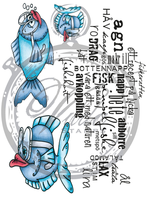
Für den Call soll man eine "Bewerbungskarte" machen, mit mindestens einer Stanze von Noor!Design. Da ich noch alle meine Stanzen aus der DT-Zeit hatte, war das für mich ein leichtes - die Auswahl, welche zu verwenden, fiel da schon schwerer! Aber letztendlich ist diese Karte entstanden.

You have to make a card to apply, using at least one die by Noor!Design. Since I kept all my dies and stamps from my time in their team this wasn't hard for me - it was way harder to decide which ones to use! But in the end I came up with this card.


Ihr kennt mich ja, zu bunt geht bei mir einfach nicht. Da das Motiv aber zumindst ein paar Farben brauchte - ich habe gleich die Chance genutzt und diese süße Tilda aus der letzten PopUp Box zu colorieren - ist mit meine Karte zumindest nicht rein blau-weiß geworden, nein, auch ein bisschen rot hat sich mit dazu gesellt. 
Das Motiv ist passend so zugeschnitten, dass der tolle verschnörkelte Rahmen dahinter passt. 
Übrigens, auch alle Papiere auf meiner Karte sind von Noor!Design. Die passen von Haus aus wunderbar zusammen.

You know me - I am not a fan of a lot of different colors on one creation. But since the image - I used the chance and inked up this Tilda from the latest PopUp Box - was asking for more than blue and white some red found the way onto my card.
The image was cut to fit onto this beautiful flourish frame.
By the way, all the papers used for this card are by Noor!Design as well. I love that they are planned to go great together.

Neben dem Motiv bzw. unter den Rahmen habe ich die Schmetterlingsbordüre gesetzt. Obenauf kam dann der Tag mit dem Umschlag, der herausgezogen werden kann. Er war im Original ein wenig lang, darum habe ich ihn kurzerhand gekürzt. 

To the right of the image and under the flourish frame I've added the butterfly border. Then I placed this slider tag on top of it. It was a bit too long for my card so I just made it shorter... ;)


Oben hatte ich zurest nur die Wolke angebracht, aber es fehlte Farbe. Darum  habe ich dieses Banner aus rot-weißem Designpapier ausgestanzt und aufgeklebt.

In the top left corner I only had the cloud first but I was missing some color there. So I've die cut the banner from red and white designer's paper and added it here.


Und hier möchte ich Euch nicht nur die Blumen zeigen, die ich als Deko auf die Karte geklebt habe, sondern auch den tollen Zaun. Der ist eigentlich aus einem maritimen Set, erinnert mich aber an diese alten Zäune, die früher um die Schrebergärten meiner Großeltern herum standen. Die habe ich schon als Kind geliebt - und darum darf mein Strandzaun auch auf nicht-maritime Karten! Für Halloween ist der bestimmt auch super.. ;)

And here I not only want to share the flowers I've added but also the beautiful fence. It's from a set of beach signs but it reminds me of those beautifully crooked fences my grandparents had around their vegetable garden and that I loved so much as a kid (and still do). So this beach fence can go onto any card of mine. Oh, and for sure it's also a great one for Halloween... ;)

Ich hoffe, meine Karte kommt an. Wenn Ihr Euch auch bewerben wollt, dann findet Ihr den Link oben im ersten Absatz des Posts. 
Alle geforderten Dinge wie Facebook, Instagram- und Pinterest-Account habe ich. Jetzt hilft nur noch Daumen drücken.

I tried to show my style with this card - yes, even if there's no cheesecloth on this one! Styles change and to me it is the most important to make the style match the dies and images used - a simply drawn image would get lost on a card like this one here. If you want to apply, too - the link is posted in the first part of this post.
I have active accounts on Instagram, Pinterest and Facebook and always stick to deadlines. I like to work ahead but am always open to re-schedule. The time on the Noor!Design Germany team was such a pleasure and from that time I have a lot of Noor! dies already. Most of them a little older but of course I wasn't able to resist all the new ones and bought some of those as well. 
I have been told I am an easy person to be in a team with, trying to help out when needed and of course enjoying some chatting around with other members, too!
All that's left know is keeping my fingers crossed.


Kaffee für Vildastamps

$
0
0

Hallo Ihr Lieben!
Wie jeden 21. eines Monats darf ich heute wieder etwas auf dem Blog von Vildastamps zeigen. Und mein erstes Werk heute ist diese Kaffeekarte.

Hello everyone!
As every 21st of a month I am sharing somethings over at the Vildastamps Blog today. And my first project is this coffee card.

Ich habe ein braunes Designpapier mit Muster für den Hintergrund gewählt und dort auch ein Doily untergebracht. Da ich etwas mehr dunkle Farbe im Hintergrund wollte, habe ich ein Stück schwarzes Cardstock am Rand gestanzt und schrag auf die Karte geklebt. Das Wort energy steckt in einem Plastiktab, das ich gerade zur Hand hatte. Und der Pfeil verbindet energy mit dem Kaffee...
Die Buchstaben für das Wort Coffee sind ausgestanzt, mit weiß habe ich Highlights gesetzt und dann alles mit Glossy Accents überzogen.
Hinter dem Kaffeebecher habe ich noch einen weißen Schnörkel aufgeklebt, der wie aufsteigender Dampf aussieht.

I went with a brown designer's paper in the background and also added a doily here. Since I wanted some more dark here I've punched the edge of some black cardstock and put it turned a bit onto my background. The word "energy" is put in a foil tab I had lying around and the arrow clip connects the energy with the coffee cup...
The letters for the word coffee are die cut, then highlighted using a white gelly pen and then covered with Glossy Accents.
Behind the coffee cup I've glued a flourish cut from white cardstock that looks like steam.


Hier ist Kaffeebecher. Er ist aus dem Stempelset Coffee Kit. Ich habe den Deckel sowie den Sleeve - gibt es dafür ein deutsches Wort? - ein zweites Mal abgestempelt und coloriert. Den Sleeve habe ich anschließend durch meinen Paper Crimper gedreht, so sieht er etwas aus, wie aus Wellpappe. Den Sleeve habe ich dann mit 3D Tape auf den Becher geklebt. 
Der Text ist aus einzelnen Buchstaben gestempelt und dann bannerförmig zugeschnitten quer über den Becher geklebt.
Das nur dezent gemusterte Designpapier im Hintergrund habe ich mit dem Scrap &  Mixed Media Kit 2 bestempelt. Der Stempel erinnert mich so toll an die Ränder, die Kaffeebecher auf dem Tisch hinterlassen können.

Here's the coffee cup. It's from the Coffee Kit stamp set. I've stamped the lid and sleeve a second time and colored those in. Then I've run the sleeve through my paper crimper so it looks a bit like made from corugated paper. Then I've glued the sleeve onto the cup using 3D tape.
The text is stamped using single letter stamps and then I've cut it in a banner shape and glued across the cup.
The only slightly patterned paper is decorated using one of the stamps from the Scrap & Mixed Media Kit 2. It reminds me of the brims a coffee cup can leave on a table.


Den Deckel des Bechers habe ich komplett abgeschnitten, beide Deckel mit 3D Tape aufeinander geklebt und dazwischen ein Stück weißen Cardstock geklebt, den ich in etwa in der Form des Bechers, nur schmäler, zugeschnitten habe. Darauf kam, wieder aus einzelnen Buchstaben, der Text "der hier geht auf mich". Es ist quasi ein Kaffee-Gutschein. 
Den Becher habe ich wieder mit 3D Tape auf die Karte geklebt, das Tape nur außen am Rand aufgebracht. So kann der Gutschein einfach herausgezogen werden.

I've cut off the lid of the cup completly, glued both lids together using 3D tape, putting a piece of white cardstock inbetween. Then I've cut the white cardstock more or less in the shape of the cup, cutting it just smaller. On top of that I've put the text using single letter stamps again to make it a voucher for a cup of coffee.
The cup itself is once again glued to the card using 3D tape, applying it only to the edge of the cup. So the voucher can easily slid into the cup.


http://shop.textalk.se/en/article.php?id=16232&art=15879010http://shop.textalk.se/en/article.php?id=16232&art=22112653

Stempeleinmaleins - Ausgabe vom 22. Juli 2017

$
0
0

Hallo Ihr Lieben!
Beim Stempeleinmaleins zeigen wir Euch heute eine Schoko-Ziehverpackung mit Slider Element. Das sieht auf den ersten Blick vielleicht kompliziert aus, ist aber wirklich ganz einfach gemacht.

Hello everyone!
Over at Stempeleinmaleins we are sharing a chocolat box with a slider element today. It looks kind of complicated but is really easy to make.


Mir war nach etwas Maritimen - darum slided diese Matrosenschnecke von LeLo über meine Verpackung. Unten habe ich eine Wellenbordüre angebracht, so dass es nun so aussieht, als würde die Schnecke wie ein Boot übers Wasser gleiten. Oben sind zwei Wolken, Möwen und die Moin Wave Stanze von Kulricke. Bei uns hier in Bayern ja eher weniger gebräuchlich, aber hier passte sie. Und zwei kleine Holzsterne passten auch noch perfekt dazu.

I felt like doing something maritim again - and so this sailor snail by LeLo is sliding over my box. I've added a wave border to the bottom so now it looks like the snail is gliding on the water, like a boat. To the top I've added two clouds, sea gulls and the word "Moin". It's nothing we use here in Bavaria - it's a north german word for like anything from good morning to good night. But here, since we only have a coast in the north of Germany, this word fit my creation. And so did those two wooden stars I've added to the top right.


Wenn man am "Tag" seitlich zieht, dann bewegt sich sowohl die Schnecke, gleichzeitig kommt auch ein Schokoladentäfelchen zum Vorschein. Ich fand diese hier so süß - und habe gar nicht gemerkt, dass sie zu hoch für die Verpackung sind... ;) Die werde ich dann nochmal etwas höher basteln. Passend zur Schokolade habe ich noch einen Text aus dem Stempelset Schokolade 2 von Kulricke mit aufgestempelt.

If you pull the tag on the side, not only the snail moves across the box, but some chocolat is gliding out as well. I like this one so much and didn't realize it's not fitting inside in height, so I will make a higher one soon. I also added a saying to go with the chocolat.


https://www.kulricke.de/product_info.php?info=p567_moin-wave.htmlhttps://www.kulricke.de/product_info.php?info=p344_schokolade-2.html

Ein Tag für Vildastamps

$
0
0

Hallo Ihr Lieben!
Da ja Samstag immer Stempeleinmaleins-Tag ist, zeige ich Euch mein zweites Werk für den Vildastamps Blog hier auf meinem eigenen Blog eben erst heute. Es ist ein Fisch-Tag geworden.

Hello everyone!
Since saturdays are reserved for Stempeleinmaleins I am going to share my second project for the Vildastamps Blog a day later over here on my own blog. I made a fish tag.


Ich habe dafür zwei identische Tags ausgestanzt und mit Distress Ink einen Hintergrund in blau gestaltet. 
Dann habe ich auf beiden Tags jeweils auf genau die gleiche Stelle - Stamping Tool sei Dank kein Problem - den Text aus dem Stempelset Fish Set sowie das niedrigere der Gräser aus dem Grass Kit Stempelset aufgestempelt. Da der Name des Fisch-Stempelsets "Fish set with swedish text about fishing" lautet, gehe ich davon aus, das passt zusammen. Denn ehrlich gesagt habe ich keine Ahnung, was genau ich da gestempelt habe. ;)
Aus dem oberen Tag habe ich dann einen Kreis ausgestanzt. Dadurch, dass alle Stempel an exakt der gleichen Stelle sitzen, sind Text und Gras fortlaufend. 
Dann habe ich die die beiden Fische aus dem Fish Set abgestempelt und ohne sichtbare Stempellinien coloriert. Ich finde die Fische mit den Brillen so klasse! Und die Brillengläser habe ich mit Glossy Accents überzogen.
Als Deko kam noch etwas gestempeltes Fischernetz dazu sowie ein paar Wasserpflanzen, Blubberblasen und ein Anker. Die Blasen bei dem großen Fisch habe ich mit weißen Enamel Accents gemacht. 
Außerdem fehlte mir noch irgendein Text. Da ich fischermäßig eher mau aufgestellt bin, habe ich einfach "Blubb" aus einzelnen Buchstaben, gestanzt aus blauem Cardstock, zusammengesetzt, mit einem weißen Gelmarker Highlights gesetzt und alles mit Glossy Accents überzogen. Und ich denke, ein "Blubb" sagt alles.
Zum Schluss habe ich die beiden Tags mit 3D Tape aufeinandergeklebt, so habe ich etwas Dimension.

I've die cut two identical tags and created a blue background using Distress Ink.
Then I've stamped both the saying from the Fish Set as well as the lower grass from the Grass Kit on both tags at exactly the same spot - no problem thanks to my stamping tool. Since the name of the Fish Set is "fish set with swedish text about fishing" I guess it fits. Honestly, I don't really have an idea what I've stamped here. ;)
I've punched out a circle from the top tag. Since all stamps are exactly at the same spot they still look like one.
Then I've stamped those two fish from the Fish Set and colored them in with no visible stamping lines. I just love those fish with their goggles! The glasses are covered with Glossy Accents.
As decorations I've stamped some fishing net and added a few water plants, bubbles and an anchor. The bubbles that come from the big fish's mouth are made using white Enamel Accents.
I also wanted some text on my tag. Well, I don't have many that go with fish so I've created a "blubb" from single letters. I don't know if "blubb" is international but in german it means the sound a bubble makes when popping out or bursting - and I guess, a "blubb" says it all. The letters were die cut from blue cardstock, highlighted with a white gel marker and then covered with Glossy Accents.
At the end I've glued both tags on top of each other with a lot of foam tape in between to get some dimension.


Ich weiß, das Bild ist unscharf, aber ich wollte Euch die eben erwähnte "Dimension" noch etwas besser zeigen.

I know, the picture is a little blurry, I just wanted to show you the said "dimensions" a bit better.


http://shop.textalk.se/en/article.php?id=16232&art=20608024http://shop.textalk.se/en/article.php?id=16232&art=12073558

Eine Hundehütte für Kulricke

$
0
0

Hallo Ihr Lieben!
Heute zeige ich auf dem Kulricke-Blog eine weitere Box.
Eigentlich - ich glaube, ich erwähnte es schon - ja eher der Katzen-Typ. Aber die süße Sally von Kulricke durfte doch bei mir einziehen. Und jetzt habe ich ihr sogar ein eigenes Haus gebaut...

Hello everyone!
Today I am sharing another box over at the Kulricke Blog.
I think I already mentioned it - but I am more a cat lover than one for the dogs. Sweet Sally by Kulricke was still allowed to move into my home. And now I've built her her own home...


Die Hundehütte ist aus derÜ-Ei-Box gewerkelt, die ich etwas abgewandelt habe. Mehr dazu erkläre ich Euch weiter unten. Die Box habe ich aus Designpapier mit Holzoptik gestanzt, das Dach ist aus rotem Cardstock.
Und hier seht Ihr auch Sally Sit in voller Pracht. Sie ist mit Copics coloriert und wieder habe ich mit einem weißen Gelmarker ein paar Punkte auf ihr Halstuch gemalt.
Für das Schild über der Tür habe ich die Schild Stanze einmal aus rotem, einmal aus weißem Cardstock ausgestanzt, nur das größere der Schilder verwendet und es wieder zusammengesetzt auf die Box geklebt.
Ein kleines Herz im Dachfirst durfte ebenso wenig fehlen wie ein kleiner Knochen für Sally.

The dog house is made using the Ü-Ei Box die and just altering it a bit. I'll tell you  more about it later in this post. The box has been cut from designer's paper with a wooden print, the roof is made from red cardstock.
And here you can also see Sally Sit. She's been colored in with Copics and again I've used a white gelmarker to add a few dots to her bandana.
For the sign over the door I've die cut the Schild die once from red and once from white cardstock, used only the larger one and put it together again on the box.
A small heart was necessary, so was a bone for little Sally.


Ich habe eine Girlande rund ums Haus gewickelt, damit es schön aussieht. Sie ist aus dem Geburtstag 2 Stempelset und per Hand ausgeschnitten. Außerdem habe ich rundum Gras "gepflanzt". Sally wollte ja auch Blumen, aber da ich nicht weiß, wo sie so überall ihren Knochen verbuddeln will, habe ich auf die verzichtet.

I've wrapped a party banner all around the house to make it look pretty. It's from the Geburtstag 2 stamp set and cut out per hand. I also "planted" some grass all around the house. Sally also asked for flowers but since I don't know where she's going to bury her bone I skipped that.


Und hier ist die geöffnete Box.
Ich habe von den längeren Seitenlaschen den Teil mit dem Euroloch abgeschnitten und an der linken das Dach angeklebt. Damit es auch von vorne schön aussieht, habe ich hier zwei passende Dreiecke angeklebt.
Die kleineren Laschen decken die Box ab. Geschlossen wird sie mit Magneten. Einen habe ich an der rechten längeren Lasche, und das Gegenstück innen am Dach angeklebt.

And this is the opened box.
I've cut off the round parts with the whole from the longer flaps and glued the roof to the left one. To make it look nice from the front I've added two triangles here.
The smaller flaps cover the inner box. The house itself gets closed with magnets. One of them is glued to the longer right flap, the other one to the inside of the roof here.


https://www.kulricke.de/product_info.php?info=p385_schild-stanze.html
https://www.kulricke.de/product_info.php?info=p627_hund--sally-sit--.htmlhttps://www.kulricke.de/product_info.php?info=p483_ue-ei-box.htmlhttps://www.kulricke.de/product_info.php?info=p135_geburtstag-2-stempel-set.html
Viewing all 2689 articles
Browse latest View live